Making reproduction floppy disk labels
How I made reproduction Macintosh floppy disk labels
I had an idea in 2021 to create and print out some floppy disk labels. Before this, I had been using unlabeled floppy disks or ones with Post-It notes for labels. This was less than ideal as the sticky notes would fall off or get stuck in a Macintosh and unlabeled disks are not particularly useful. I recently acquired a large number of used 3.5” floppy disks, so I had the thought of creating install disk sets for the Macintoshes I commonly use as well as System Software versions I commonly need. A set of System 7.1.1 disks for my PowerBook 540c, for example. And a set of System 7.5.3 disks as well. I realized that I could make a suitable set of labels for the disks and print them out with a cheap inkjet printer. So I ordered a pack of labels from Avery and got to work.
Making a label template
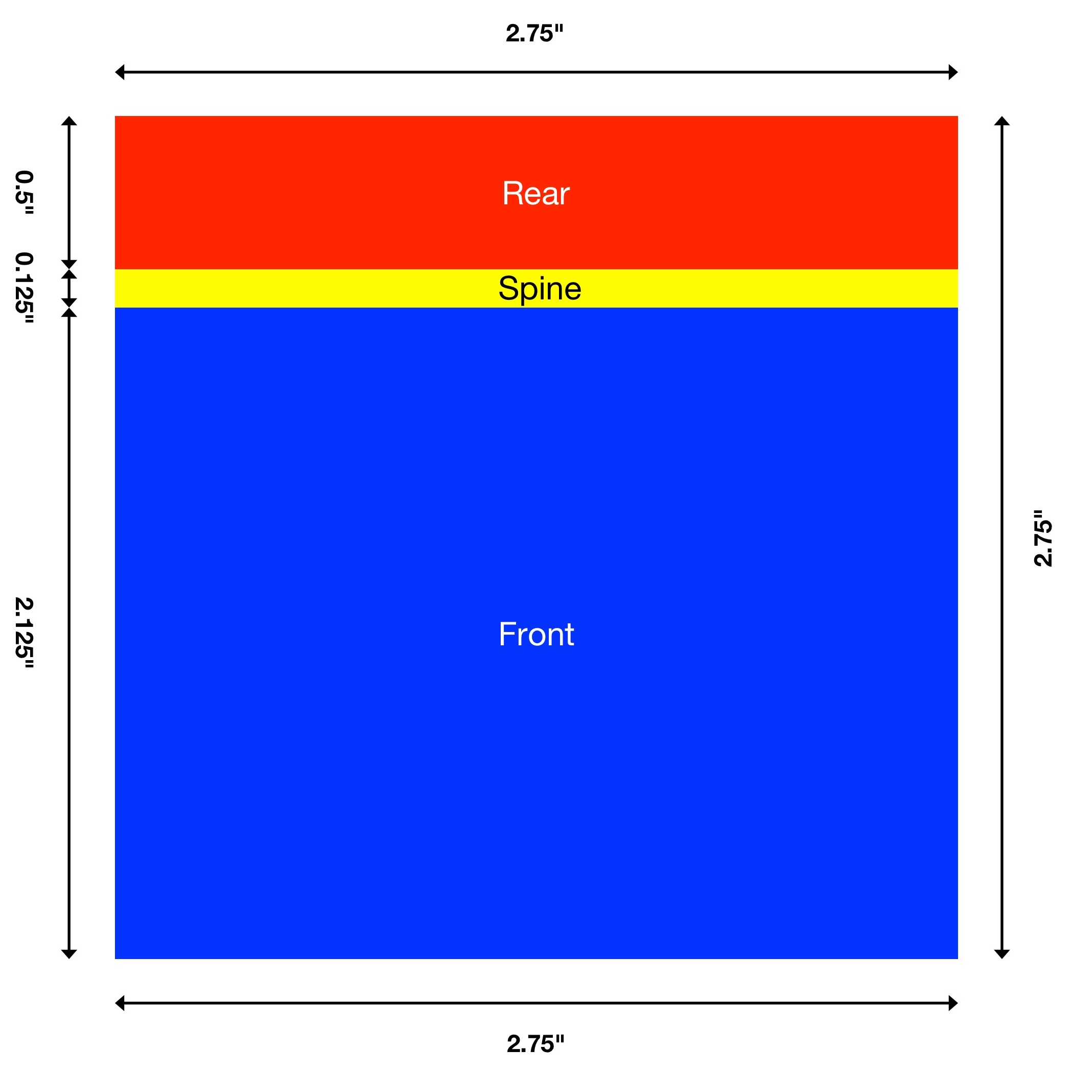
The first step was to measure the front, spine, and rear label areas of a 3.5” floppy disk. The front label area is 2.75 inches wide and 2.125 (2 1/8) inches tall. The spine is 2.75 inches wide and 0.125 (1/8) inches tall. The rear label area is 2.75 inches wide and 0.5 inches tall. The three label areas sum together to form a 2.75 inch square with rounded corners. This makes a single label that wraps from the front to the rear.
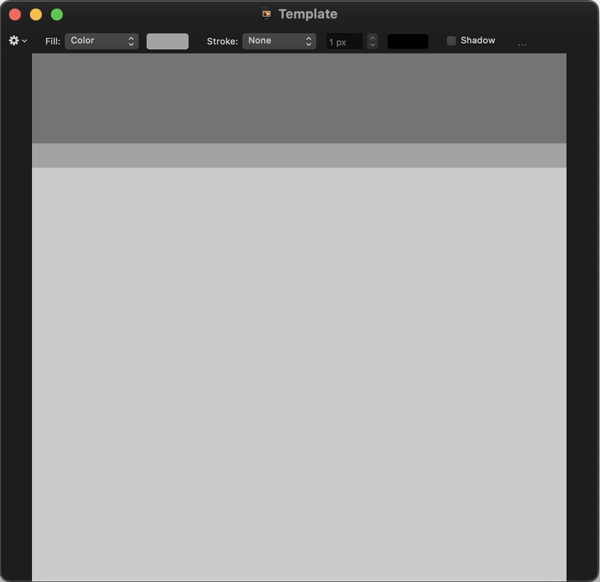
The next step was to create a new project in Pixelmator Classic. I made a canvas that’s 2.75 inches wide and 2.75 inches high at 600 pixels per inch. I then locked the background layer to avoid accidentally dragging the background around the canvas and created a square shape on the canvas. I resized the square shape to 1650 (2.75”) pixels wide and 1275 pixels (2.125”) high to form the front label area. I gave it a light gray fill color to tell it apart from the background and set the border stroke to none so that it became borderless. I then added another square and resized it to 1650 pixels (2.75”) wide and 75 pixels (0.125”) high for the spine area and gave it a slightly darker gray fill. And a final square shape resized to 1650 pixels (2.75”) wide and 300 pixels (0.5”) high with a dark gray fill for the rear area. This makes a good template for a floppy disk label with clearly defined front, spine, and rear printable areas.
A history of Apple’s floppy disk label designs
The First Era: Picasso logo (1984-1985)
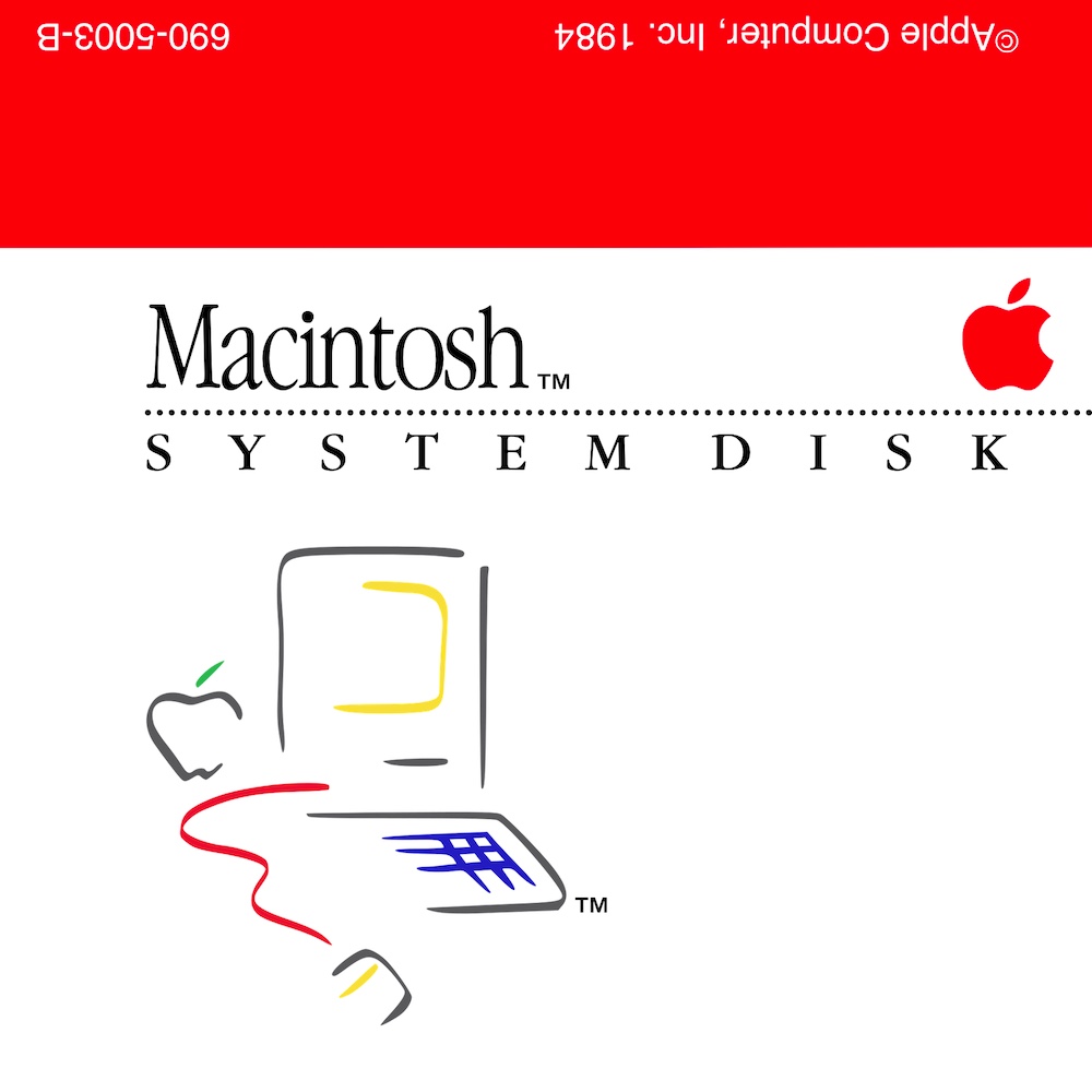
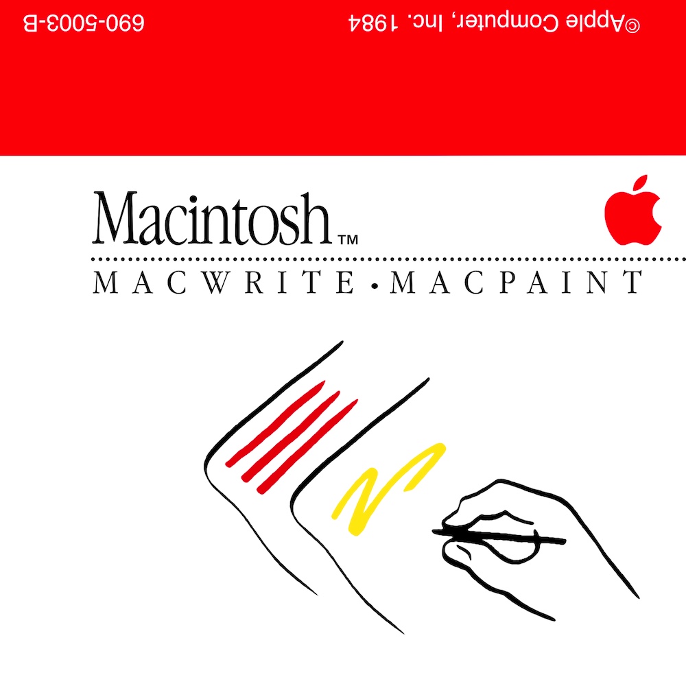
The first label I made was for a Macintosh System Disk, the kind that use the Picasso-style graphic. Apple used this label style for the disks that came with the Macintosh 128K and 512K. As far as I can tell, this style was used through System 2.0 in 1985. Apple stopped using this design with the release of the Macintosh Plus and System 3.0.
These were fairly tedious to recreate. I found a few eBay listings for disks that use this label design and used them as reference material. The first step was to change the spine and rear fill color to red. I then added the copyright text and part number text in white Helvetica and placed them in rough approximation to how they appear on the original label. Text in the spine and rear areas must be rotated 180 degrees so that it appears correctly when the label is printed and applied to the disk. Early Mac disks did have text in the spine area, but I can’t find a clear reference picture of the text, so I left it out.
For the text on the front, I did have to play around with the kerning until the spacing between letters closely matched the reference photo. I then had to convert the title text to vector shapes and horizontally compress it until it looked correct. And then add the little “TM” glyph to the right of the title and played around with the positioning until it also appeared to match the reference photo. Much of the same applies to the SYSTEM DISK subtitle, it has a lot of kerning adjustments between letters and is stretched horizontally to look correct (most noticeable with the “D” in “DISK”). I then added a dotted line and changed the size of the dots and relative positions of the text and line until it visually matched the reference photo. I found a monochrome red Apple logo and dropped it on the canvas, resizing and moving until the positioning appeared correct.
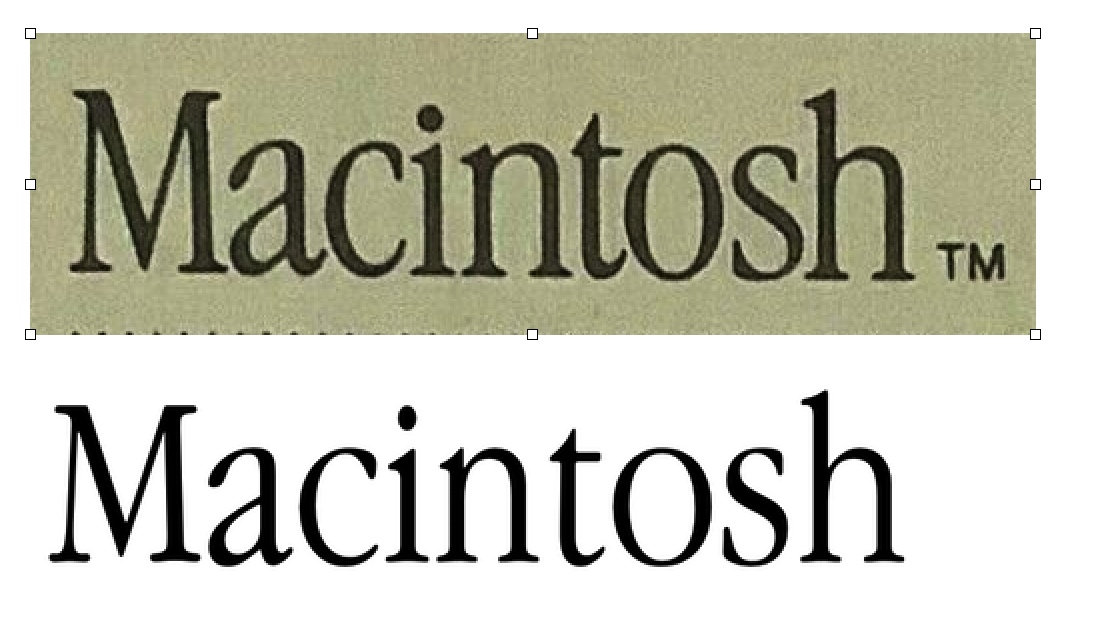
Much of the proportionality is subjective. And, it seems Apple did some funky typographical work on these labels. Look closely at the “i” and “h” in the following example:
 I did a little manual editing to get the Macintosh wordmark to appear closer to how it does on the original disk, but I gave up on trying to make it match exactly. It’s just too much fine-detail work.
The last two elements are the Picasso-style Macintosh logo and its trademark symbol. This was probably the easiest part, I found a fairly clean copy of the logo and used the eraser tool to remove the white background. I then placed it on the canvas and resized it so that it looks approximately the correct size and position. I then ensured the logo aligned with the left edge of the title and subtitle text and that the spacing between the subtitle and top of the logo looked correct. That’s about it for this style of label.
This next label is one I’m quite proud of: MacWrite • MacPaint disk
I found an eBay listing for the disk and used that picture as a baseline. I made a new canvas, dropped in the image, and stretched the image to 200% and began tracing over it. After about an hour of manually retracing it, I made a discovery: the paint bucket tool in Pixelmator is smart! Similar to how the eraser tool can be used to select areas of similar color to be removed, the paint bucket can select areas of similar color to be painted over without affecting other lines nearby or the background. This dramatically simplified the process as I just had to use the paint bucket to paint over the lines and smooth out the edges. I chose a mustard-like yellow for the MacPaint portion and ketchup-like red for the MacWrite portion of the drawing. It turned out rather well.
The Second Era: FatBits icons (1984-1986)
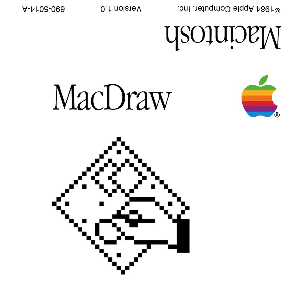
Apple used this style of label starting sometime in 1984 for Macintosh applications that were not bundled with the system such as MacDraw or MacTerminal. This style was later used for Macintosh Plus/512Ke bundled disks and also Lisa Office System 3.0 disks. These label designs are a lot simpler as they have just a FatBits bitmap of the app icon and a rainbow Apple logo. The early version of this design is notable for having the platform name in large type on the rear (“Macintosh” or “Lisa 7/7”), this aspect was dropped sometime in early 1985.
Thiss design was easier to recreate than the Picasso, though I still had to heavily tweak kerning.
![]()
For the icons, I made a 32x32 pixel canvas in Pixelmator Pro and increased the zoom by a ridiculous amount. I then recreated each icon pixel-by-pixel then turned off the grid overlay and took a screenshot of the canvas. I trimmed the screenshot down to a perfect square and effectively left me with a 2048x2048 FatBits icon.
![]()
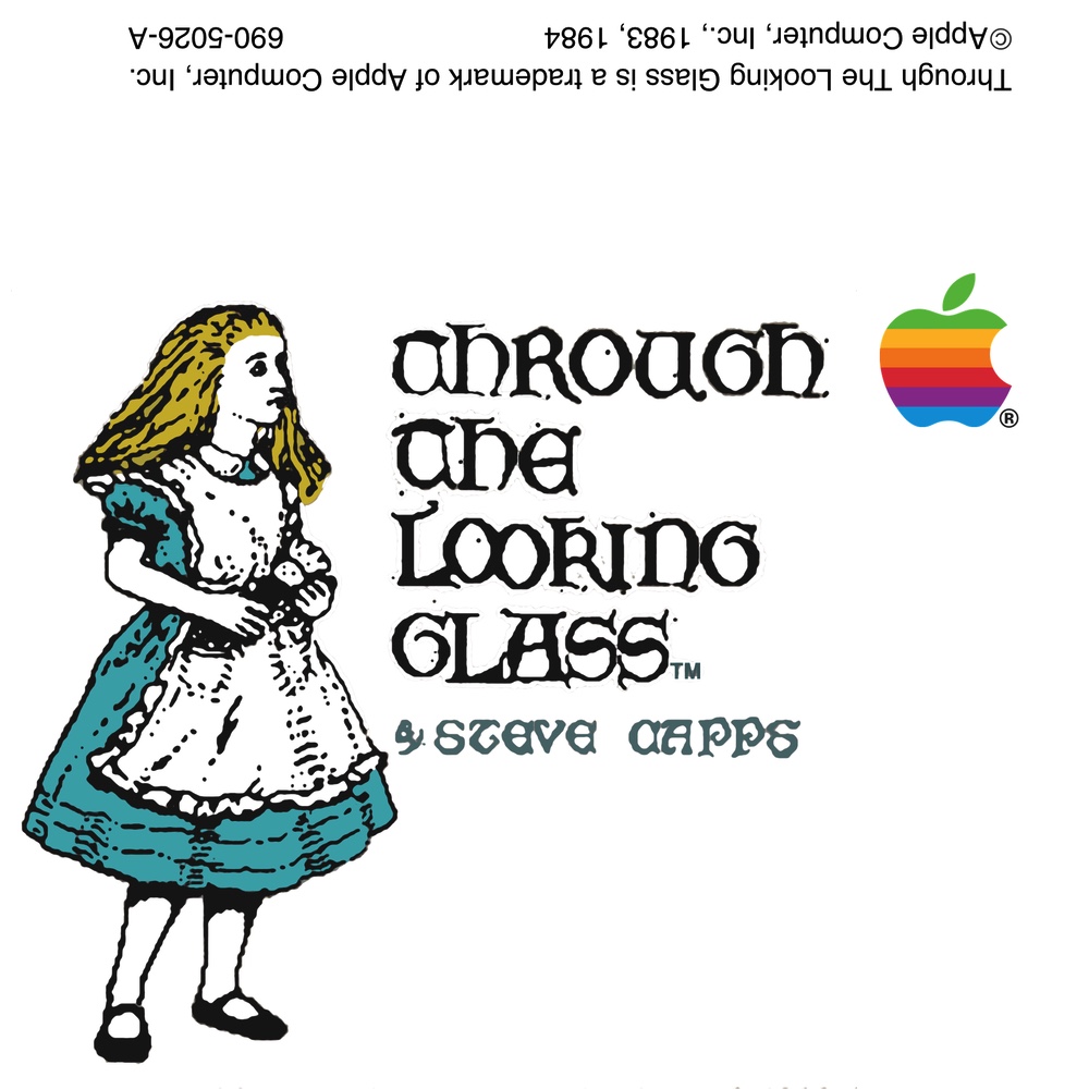
Bonus: Through the Looking Glass Based on a photo of the real label, I tried to clean up the text and icon to the best of my (limited) abilities.
The Third Era: A more professional appearance (1987-1988)
This label is similar to the FatBits style, but without an application icon on the label and having the Macintosh wordmark set in white text on a black rectangle. These labels appeared in 1987 with the release of the Macintosh SE and Macintosh II and spread to the remainder of Apple’s product line. Printed material, such as the Macintosh Owner’s Guides, used this design as well. My assumption is that Apple was trying to appear more “professional” to match the target audience of the Macintosh SE and Macintosh II. System 4 and System 5 both use this label design.
Recreating this label was very simple, it did not require stretching text vertically or anything complicated like the Picasso logo or FatBits disks. The only adjustments needed are some kerning tweaks and the use of Helvetica Condensed for the copyright text and part number. Since there were no icons, it was only a matter of getting the layout right.
The Fourth Era: System 6 (1988-1989)
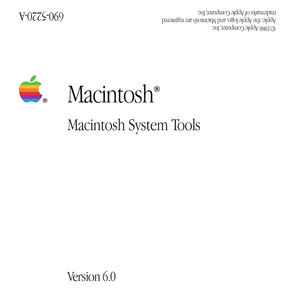
This label is a further simplification of the System 4/System 5 label design, removing the black rectangle and making the Apple logo smaller. I like this quite a bit, they’re simple and understated. These labels were used in the early System 6 era from 1988 through late 1989. Notably, this is the first design that had the System version on the label.
Again, recreating these labels were simple as they focus on typography and only minor kerning adjustments were needed.
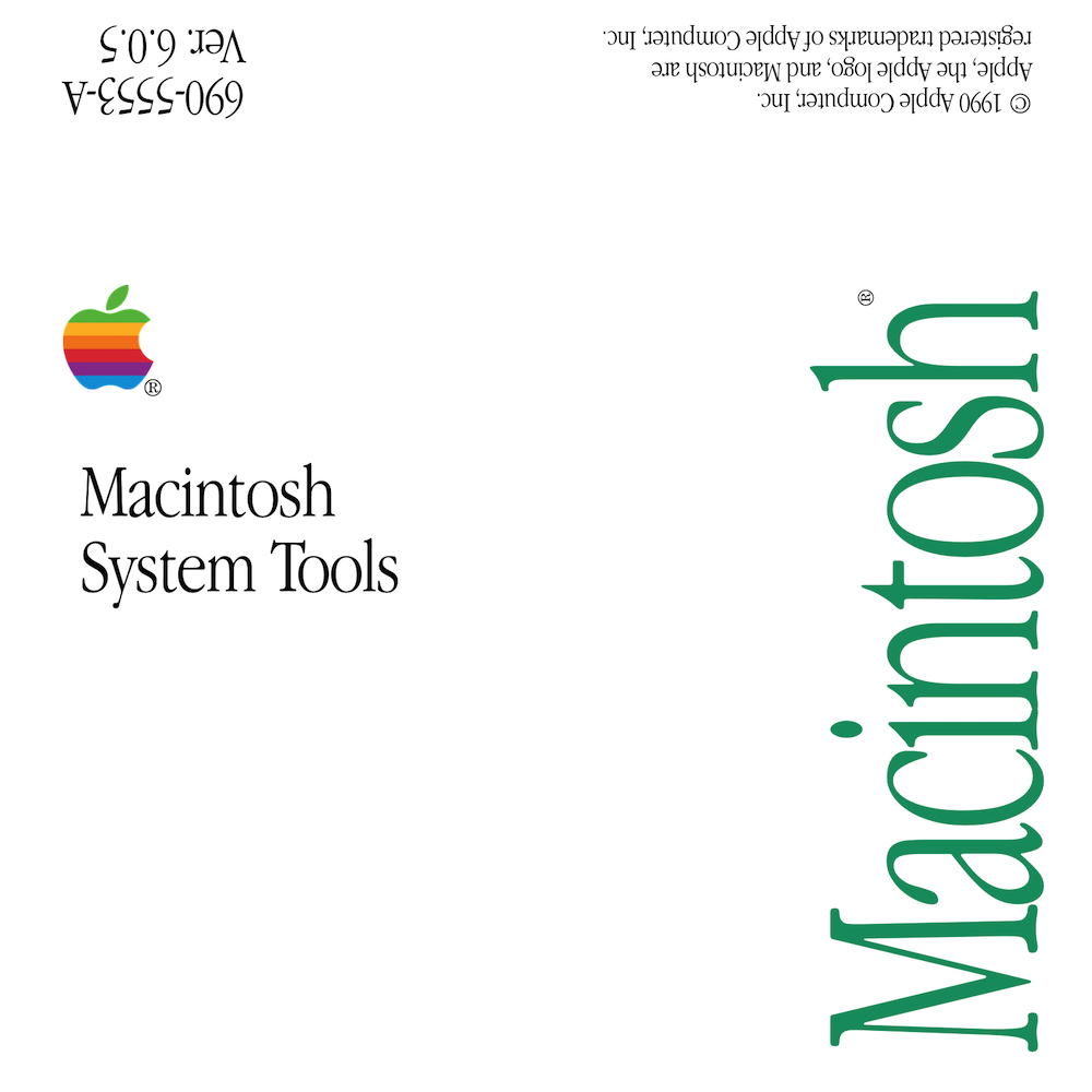
The Fifth Era: System 7 and the late System 6 versions (1990-1991)
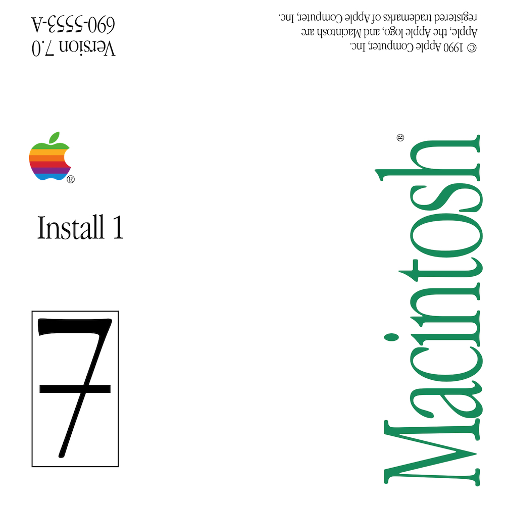
This label is the first design since FatBits that hasn’t removed a design element. The major change is the Macintosh wordmark is much larger, is green in color, and is flipped 90 degrees and aligned to the right edge. To emphasize that this is System 7, there is a large number seven that is crossed and inside a box. My recreation of this label is slightly lacking, the real labels have a pixellated shadow below the large number seven. I’ll get around to doing it eventually, it’s just too much work for me to want to do right now.
This design was also used starting in the late System 6 era of 1990.
The Sixth Era: System 7.0.1 and the advent of System Enablers (1992-1993)
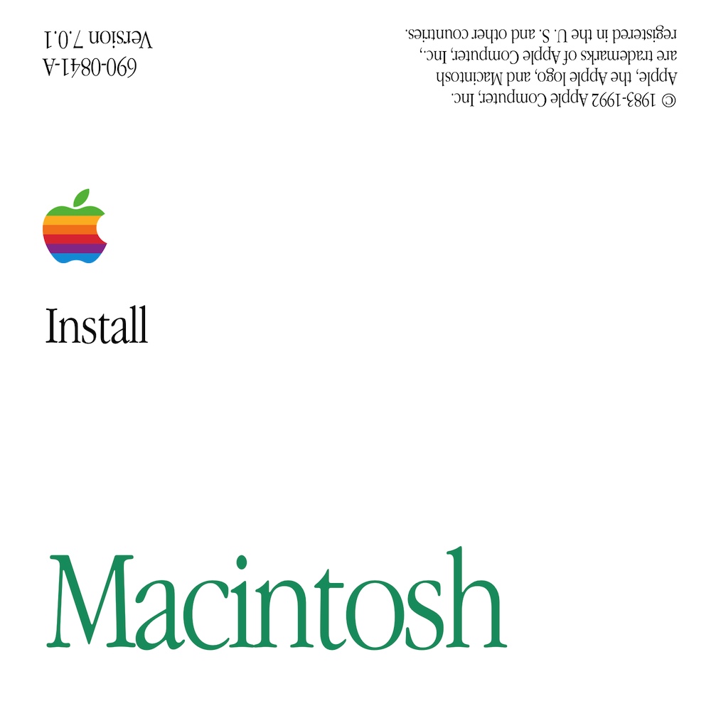
This design moves the Macintosh wordmark back to the bottom and removes the garish “7” logo. This design accompanied the first PowerBooks and the first Quadras.
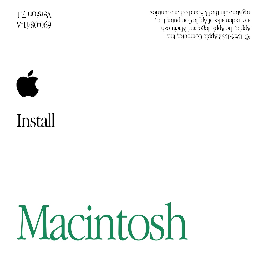
The rainbow Apple logo was removed, a monochrome logo was substituted in its place.
Notably, this era had the first system-specific install media. Starting with System 7.1, Apple no longer released new versions of System Software for the launch of a new Macintosh. Instead, a new Mac would ship with three to four model-specific disks and the remainder were standard disks. The model-specific disks had a subtitle with the model name. For example, the following image is the Install Me First disk for a Macintosh Quadra 605:
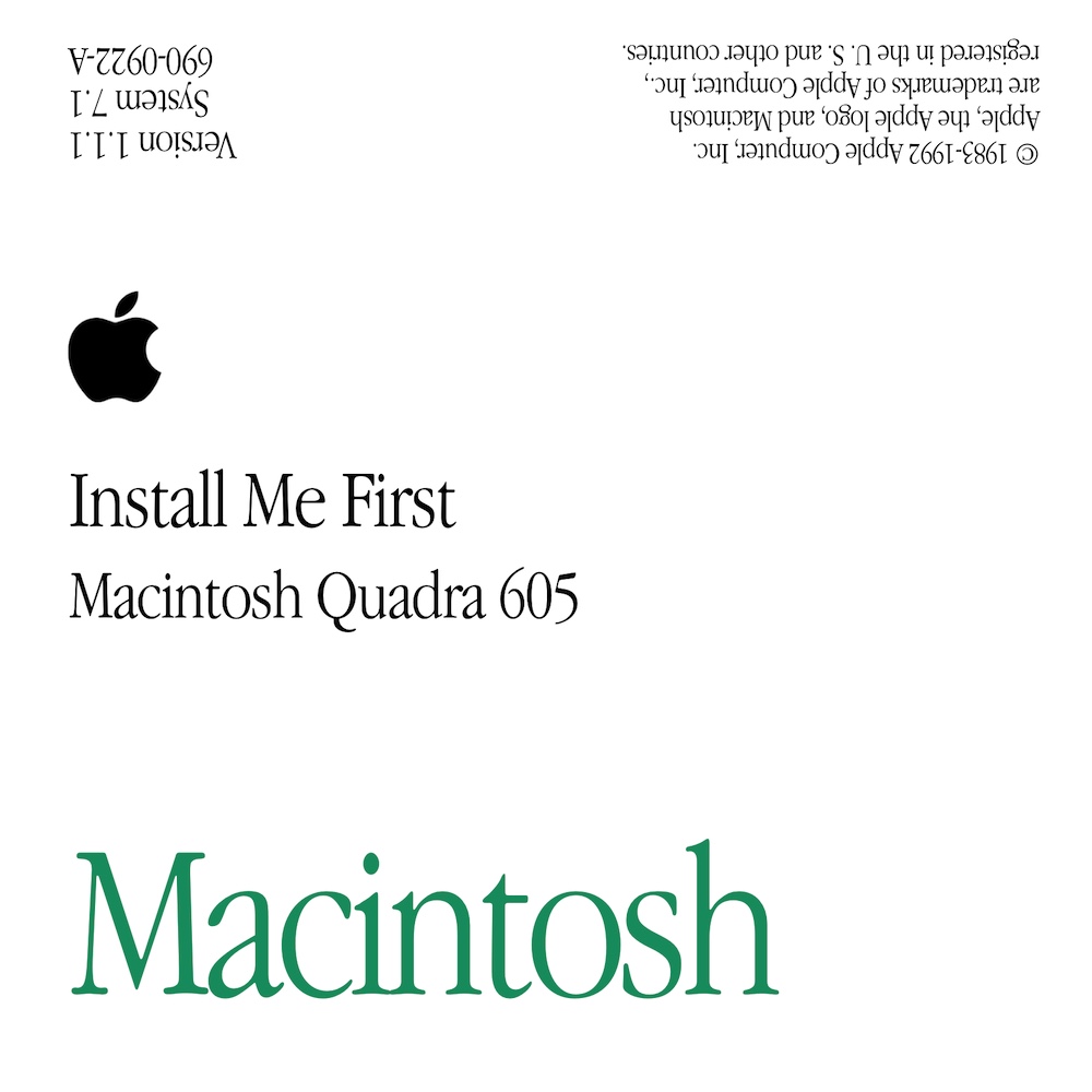
Instead of booting from the usual Install disk, the user would boot from the Install Me First disk, which had the appropriate System Enabler that allowed an otherwise unmodified System 7.1 to boot. The two other model-specific disks were Disk Tools (again, with the System Enabler to allow it to boot) and Extras. The remaining Install, Install 2, Fonts, Tidbits, and Printing disks were stock System 7.1 disks.
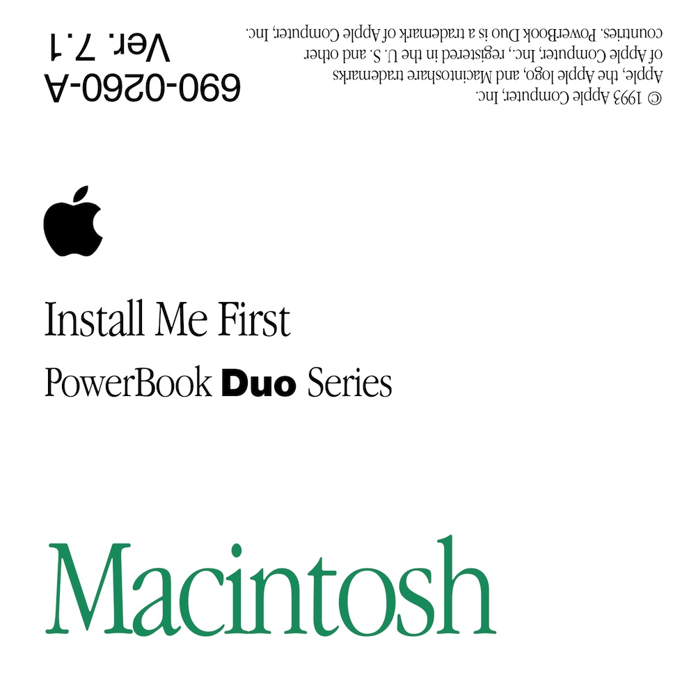
The PowerBook Duo installation disks were interesting to me as I could not get the Duo wordmark to look right. It turns out that Apple used Helvetica Heavy rather than Helvetica Bold.
Macintoshes in this era with built-in CD-ROMs shipped their recovery media as a bootable CD-ROM rather than a set of floppies. Thus lessening the need for floppy disk labels.
The Seventh Era: System 7.1 through 7.5 and the end of floppy disk labels (1994-1996)
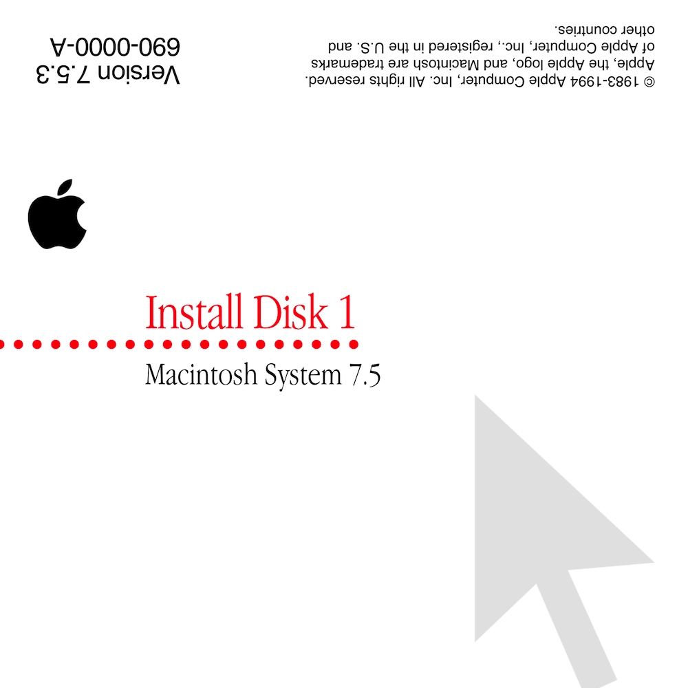
This is my least favorite design. Apple started using it in the late System 7.1 era around the time of the PowerBook 500 and through the end of the System 7.5 era. System 7.1 could still be installed from a set of six disks, but System 7.5.3 was so large that it required sixteen disks. Macintosh System Software was increasingly being distributed on CD-ROM, so this lessened the need for a set of floppy disks as recovery media.
Design wise, this is fairly simple: some text, a dotted line, and a mouse cursor with the opacity turned down. Easy to recreate.
This really is the last floppy disk label design that Apple made. Later labels are text-only and don’t wrap around to the back (Mac OS 8 Disk Tools floppy, for example).
Where can I download the labels you’ve made?
I’m working on re-making my label templates. I discovered that the labels I made prior to writing this post are subtly wrong. Specifically, the template’s canvas should be eactly 1650 pixels by 1650 pixels. My existing templates are 1699 pixels by 1699 pixels. This annoys me greatly. I will need to fix this before I share my templates.
I made these templates with Pixelmator Classic, so the labels are in Pixelmator document format.
Here are the templates I’ve re-made so far:
And a selection of specific disk labels: